Posted by eyer at 09:27 PM. Filed under: typography
Saturday, June 25, 2011
Monday, June 20, 2011
Earlier this year, Tokyo-based type foundry Wordshape published my typeface Cinta Adhesiva. I designed the font using tons of adhesive tape, hence the name. I've been incorporating it into much of my recent work, so I thought I'd share a bit about its background.
An early version of Cinta Adhesiva appeared on the cover of a few issues of a graffiti zine I put out called Free Copy. It was then developed further for another zine I made in collaboration with Moab called Text. (I'll be posting downloadable copies of some of the early issues soon.)
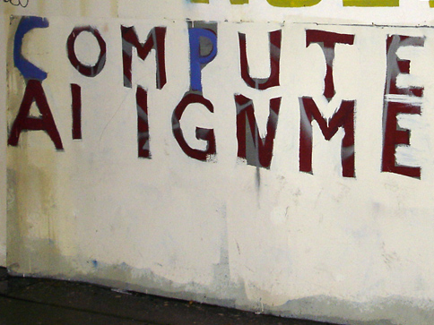
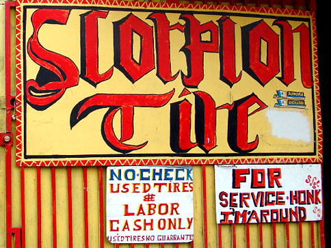
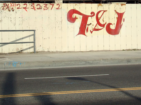
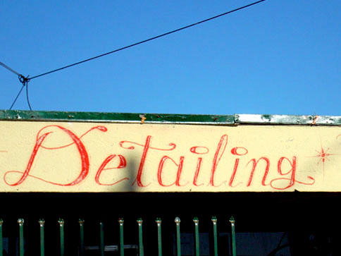
Cinta Adhesiva was inspired in part by signage I'd been documenting over the years that incorporated stencils clearly formed by adhesive tape and/or featured letters drawn by using the tape itself.
I also looked to hand-painted letters and numerals for inspiration, particularly those executed with broad brushes and paint rollers.
The random traces of tape left behind on many city surfaces helped me work out the font's punctuation marks and special characters.
Of special note is the large-scale lettering of graffiti writers Hael and Crae. Their work directly informed the weight of Cinta Adhesiva and the decision to shape the letters using wide tape.
I am currently working on a type specimen/zine featuring Cinta Adhesiva. I'll post it here when it's done. In the meantime, you can peep more info on Wordshape and MyFonts. Over and out.
An early version of Cinta Adhesiva appeared on the cover of a few issues of a graffiti zine I put out called Free Copy. It was then developed further for another zine I made in collaboration with Moab called Text. (I'll be posting downloadable copies of some of the early issues soon.)
Cinta Adhesiva was inspired in part by signage I'd been documenting over the years that incorporated stencils clearly formed by adhesive tape and/or featured letters drawn by using the tape itself.
I also looked to hand-painted letters and numerals for inspiration, particularly those executed with broad brushes and paint rollers.
The random traces of tape left behind on many city surfaces helped me work out the font's punctuation marks and special characters.
Of special note is the large-scale lettering of graffiti writers Hael and Crae. Their work directly informed the weight of Cinta Adhesiva and the decision to shape the letters using wide tape.
I am currently working on a type specimen/zine featuring Cinta Adhesiva. I'll post it here when it's done. In the meantime, you can peep more info on Wordshape and MyFonts. Over and out.
Posted by eyer at 11:48 PM. Filed under: typography
Wednesday, March 23, 2011
Screen grab courtesy of Swanky. Cinta Adhesiva available at wordshape.com.
Posted by eyer at 02:27 PM. Filed under: typography
Tuesday, February 15, 2011
Because sharing is caring: Lettering from Sanborn Fire Insurance Maps circa 1880-1920. (Via BibliOdyssey.)
Posted by eyer at 11:44 PM. Filed under: typography
Thursday, January 06, 2011
Cool video of some pretty nifty handwriting demonstrated by Luca Barcellona aka Bean One. (Thx for the heads up, Makaga!)
More from Bean here.
Posted by eyer at 11:40 PM. Filed under: typography
Sunday, September 26, 2010
The homie Suede put me on to this rad video about a sick sign painter slash glass embosser dude named David A. Smith. Peep game.
Posted by eyer at 10:29 PM. Filed under: typography
Thursday, September 09, 2010
A sample of handstyles by Tempt from his upcoming zine. Spread The News!
Posted by eyer at 10:52 PM. Filed under: typography
Saturday, August 21, 2010
I attended Typecon today and heard a super rad lecture by Adrian Wilson on the typography of textile trademarks from the 19th century.
Adrian Wilson on Textile Trademarks.
More on the lecture (with an accompanying PDF) on Woodtyper.
More on Typecon here.
Posted by eyer at 08:09 PM. Filed under: typography
Saturday, May 22, 2010
>
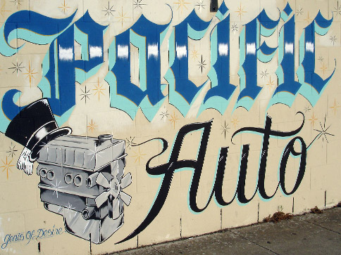
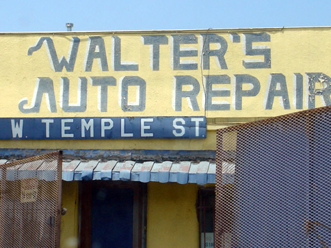
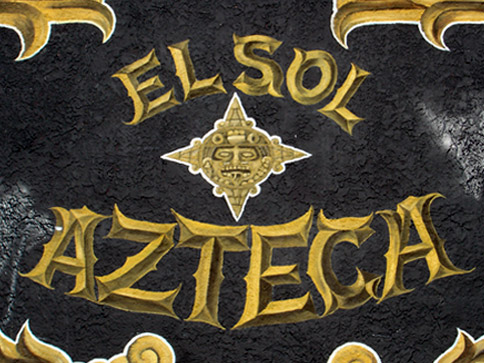
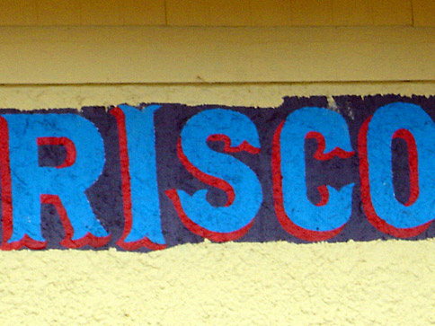
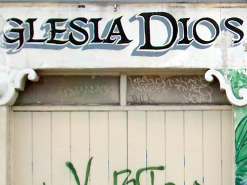
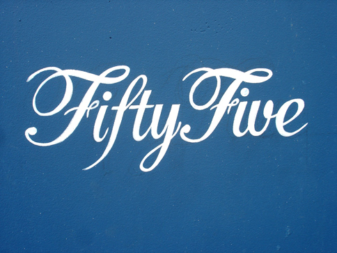
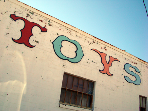
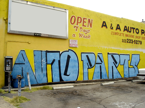
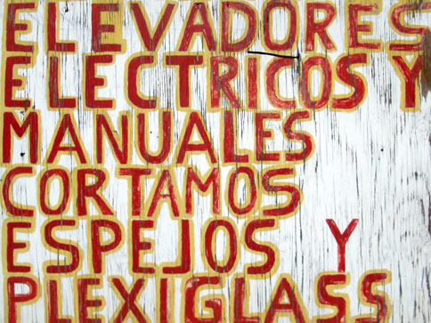
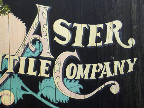
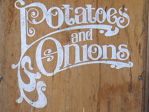
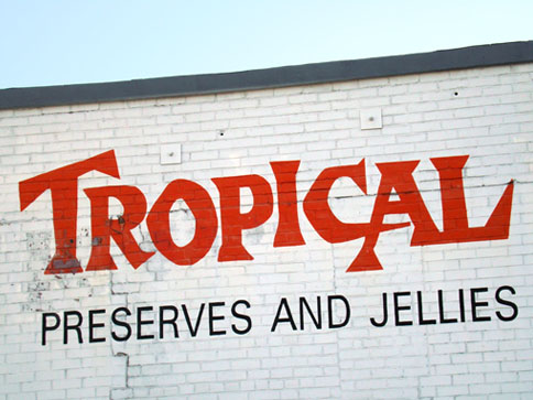
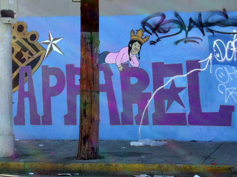
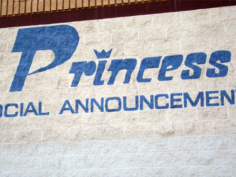
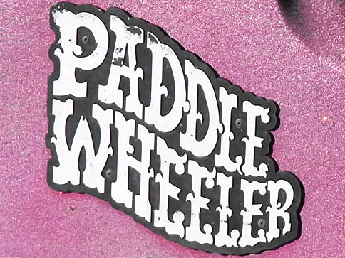
Gathered these images on a few random bike rides around town...
Posted by eyer at 09:46 PM. Filed under: typography
Tuesday, February 02, 2010
Here are some more inspiring blasts from the past in the typography and letterforms department from the old blog. My two main sources for these were a collection of old photo albums I digitized for a genealogy book and a bunch of old maps I researched for a cartography project.
Posted by eyer at 01:40 AM. Filed under: typography
Sunday, January 24, 2010


I finally got around to recovering most of my long-gone image posts dealing with typography and related things. These are some oldies but goldies.
Posted by eyer at 01:39 AM. Filed under: typography